You finally click Buy Now—not out of impulse, but after weeks of comparison tables, review videos, and the quiet promise that this one tool might actually make work feel less like juggling chainsaws. You install the software with the same reverence you reserve for new shoes: hopeful, slightly suspicious, committed to walking it in properly. For a brief moment, the desktop is serene, and you are the kind of person who gets things done without drama.
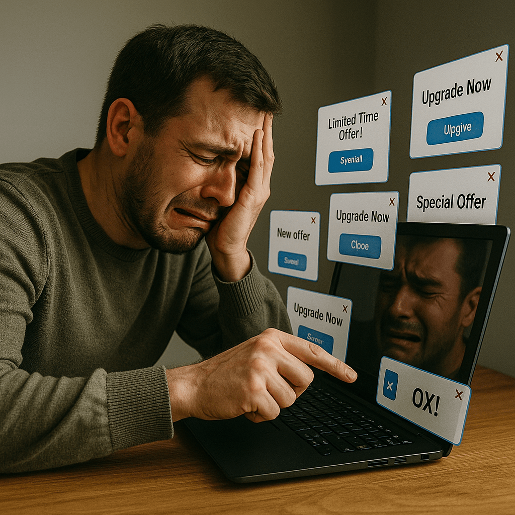
Then the pop-ups arrive, each with the chirpy confidence of a salesperson who never learned to read a room. One insists you could “unlock pro-level mastery”; another hints that your current plan is charmingly amateur; a third reminds you that “for a limited time” (which somehow lasts all year) you could pay more to feel complete. The windows stack like plates in a diner sink, and suddenly your computer is less a tool and more a carnival barker with a keyboard.
Pause the subscription for a month while you travel or focus elsewhere? Your inbox gets the emotional equivalent of late-night texts: “We miss you.” “Are we okay?” “Do you still like features?” Cancel outright and you’re marched through a solemn exit interview, asked if the software disappointed you, if you’re leaving for someone shinier, if you really mean it this time. The software is not merely installed; it has moved in, learned your habits, and taped its upgrade flyer to your fridge.
The Age of Persistent Pop-Ups
It always begins politely. A tasteful modal suggests you might enjoy the advanced toolkit that “professionals rely on.” The copy is soothing, the design is gentle, and the button glows like a small pool of warm water. Decline once, and the offer returns. Decline twice, and it returns with a friend. Eventually, the interface learns to occupy the exact portion of the screen you need most—covering your timeline, your canvas, your export menu—because engagement is higher when the “X” is half-hidden behind a moral dilemma.
What we used to call “alerts” are now orchestrated campaigns. Tiny red badges count like geiger counters. Notification trays bloom like spring. Your desktop becomes a neighborhood with one very persistent leaflet distributor who is positive that today you’re finally ready to consider “Premium.” The messaging is upbeat but relentless, selling the feeling that you’re on the cusp of being the person you meant to be, if only you’d upgrade to prove you’re serious.
The sale doesn’t end at checkout; it simply changes costume and stays for dinner.
We adapt, of course. We learn to close windows without reading them, to dodge the stutter-step that places the “Upgrade” button where “Continue” used to sit, to hover our cursor like a fencer anticipating a feint. Yet each dismissal leaves a residue of attention spent, a tiny tax on focus that compounds over days. The promise of smooth productivity becomes a maze of velvet ropes, all leading back to the gift shop.
Why Do Companies Keep Nagging Us?
Because framed properly, nagging is a growth strategy. Entire teams now apply behavioral science to funnels, experimenting not with product quality but with timing, color, copy, and friction. Their work has a tidy term—dark patterns—and a growing field manual. If you’d like a grounded tour, Wirecutter has documented many of these patterns in everyday interfaces: dark patterns in everyday interfaces. The short version: persuasion becomes architecture. “No” is made physically smaller. “Yes” becomes a gradient button—large, luminous, and spiritually approving.
When software is measured by monthly recurring revenue, the relationship doesn’t end when you’ve paid. It begins. Retention and expansion are the real scoreboard, and every prompt that nudges a trial into a plan, a plan into a tier, a tier into a bundle, is a step forward in the deck on Monday morning. Your attention is a KPI. Your patience, a variable to be optimized. When an upsell appears at the exact moment you hit “Export,” it’s not a coincidence. It is choreography.
The Psychology Behind Subscription Fatigue
Subscription fatigue is not merely a tiredness of paying; it’s the cognitive drag of perpetual negotiation. Instead of a clean arc—consider, purchase, use, finish—we live inside an ongoing conversation that presumes our consent to be asked again. The product becomes a partner with needs. It wants feedback. It wants to check in. It wants to celebrate anniversaries with a small discount in exchange for your soul and a two-year commitment.
Each message triggers a tiny calculation: Is this worth it? Is now the right time? Am I missing out? Small choices consume the same decision-making circuitry we need for meaningful work. The result is the subtle exhaustion that shows up not as drama but as static—the sense that everything demands just a little too much attention to do anything exceedingly well.
Our focus is finite; every pop-up spends a coin we needed for something we actually care about.
There’s also the emotional framing. The copy hints that your current self is a respectable draft, while your premium self lives just one tier higher. That tension—between who you are and who you could be if you would simply subscribe—keeps the window glowing. And when every tool, from note apps to to-do lists, adopts this script, the combined effect is less like progress and more like being gently scolded by your devices for failing to self-actualize.
Is There Any Escape From the Upsell Spiral?
There are workarounds, though they tend to feel like rearranging furniture on a moving train. You can migrate to web-based tools to avoid desktop prompts, but the browser brings its own chorus of tabs asking for permission to notify, to track, to send helpful reminders at the worst possible time. You can uninstall software between projects, but traces linger—launch agents, background tasks, anonymous helpers with cheerful names that reappear like houseguests who “just happen to be in the area.”
Some advocate for a minimalist stack: own fewer tools, learn them deeply, and freeze versions like old photographs. Others lean into the walled gardens of bundled ecosystems, trading some freedom for fewer logins. Consumer advocates have been cataloging the most egregious traps and offering advice on how to avoid them; see, for instance, guidance from Consumer Reports: subscription traps and how to sidestep them. The spirit of the advice is practical but sobering—there’s no single switch to flip; you assemble your own peace from a kit.
And then there’s the unicorn solution: buy-once software with reasonable updates and no psychology degree embedded in the UI. It exists, though it’s rarer in a world where predictability for shareholders often outruns serenity for users. When you do find it, the sensation is almost quaint: you pay, you download, you use, and nothing else happens. The silence is luxurious.
When “Customer Experience” Becomes Customer Exhaustion
Most of this is packaged as “customer engagement,” a phrase that sounds like warm towels and mint tea but often feels like a treadmill with the speed controls hidden under a dropdown. Support portals hide the cancellation link as if it were witness protection. Chatbots steer you through a script designed to produce a particular outcome: keep you in the funnel or escort you out with a final offer you’ll tell your friends about. Meanwhile, the word loyalty is applied to both dogs and dashboards, which seems unfair to dogs.
Journalists and designers have been calling out this creep for years, asking why frictionless design always seems to apply to the buy button and rarely to the exit. Fast Company’s coverage of UX’s more manipulative tendencies is useful context for understanding how we arrived here, where the tension between growth and goodwill is framed as a clever A/B test rather than a philosophical question about respect.
Customer experience should feel like hospitality, not a custody battle for your attention.
What’s lost in the metrics is the long arc of trust. When an app respects boundaries—stays quiet when paused, vanishes when uninstalled, says goodbye without theatrics—we remember. We also tell people. The future doesn’t just belong to whoever monetizes best; it belongs to whoever can create value without exhausting the very mind that came looking for help.

A Quiet Return to Choice
Opt-out should be the default. Not because we dislike features, but because choice is part of the value we pay for. Let the software be excellent and quiet. Let the upgrade path be there when we seek it, obvious without being needy, generous without being clingy. If we want the premium brushes, the extended export options, the collaborative timeline, we’ll find them. We’re not bad at the internet; we’re just allergic to being shepherded.
When the tools we use treat our attention as precious rather than available, we do better work. We also become the kind of customers who return—not because we were nagged, but because we were respected.
Perhaps the compromise looks like this: products that are compelling enough to earn the upgrade and confident enough not to beg for it. A settings panel where “Marketing” is a light switch, not a scavenger hunt. An offboarding page that behaves like an adult—brief, dignified, and honest—because endings are part of any healthy relationship, even with a spreadsheet.
Until then, we can tidy our stacks, mute what we can, and notice how often “more features” is just a louder room. We can favor the makers who build for clarity over capture. And we can remember that sovereignty over our focus is not a luxury add-on—it’s the feature that makes everything else possible.